
There’s always that one color that doesn’t ask for attention. It takes it.
2026 was supposed to belong to Cloud Dancer, Pantone’s soft, barely-there whisper of a shade.
Polite. Elevated. Safe. But fashion doesn’t move politely anymore. It swerves. It scrolls. It reacts in real time.
And right now? Everything is pointing to one icy conclusion.
Cool blue is taking over.
Not loudly. Not aggressively. But in that quiet, hyper-confident way that makes everything else feel a little… try-hard.
From Soft Girl to Ice Queen
Last year, it was butter yellow.
It arrived gently, almost shy. Then suddenly it was everywhere. On glazed nails, satin dresses, glossy campaigns.
It felt warm, nostalgic, a little edible. Think candy wrappers, lip gloss, sunlight hitting silk.
You saw it in the way Hailey Bieber built entire Rhode visuals around that creamy tone.
You saw it in Prada’s playful candy-coded beauty moments. You saw it in pop culture, where sweetness became aesthetic currency.
Butter yellow didn’t scream trend. It melted into one. Check our YELLOW IS THE MOMENT’s Article.
And now? The temperature just dropped.
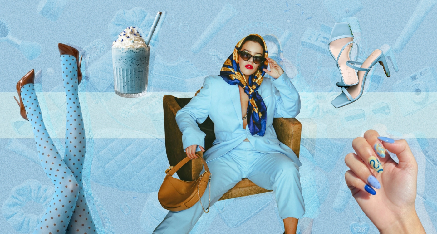
Enter: Cool Blue
According to Pinterest Predicts 2026, cool blue is set to dominate across fashion, beauty, and interiors.
We’re talking icy, aquatic, almost digital tones. Not your basic pastel. Not your safe sky blue.
This is sharper. Cleaner. A little futuristic. Vogue has already clocked it too. As they put it, cool blue is becoming a defining shade of the year, replacing warmth with clarity, calm, and a kind of emotional distance that feels very now.
That’s the shift. We’re moving from comfort to control.
The Hailey Effect (Again)
And yes, let’s talk about it because Hailey Bieber is already there. Again.
Her latest campaign leans heavily into this icy blue universe.
Glossy, minimal, almost clinical but still sensual. It doesn’t feel accidental. It feels… early.
So the question isn’t, is cool blue trending?
It’s: did she already know?
At this point, calling her a trend follower feels outdated.
She’s operating more like a mood forecaster with a marketing team that understands timing better than most brands.
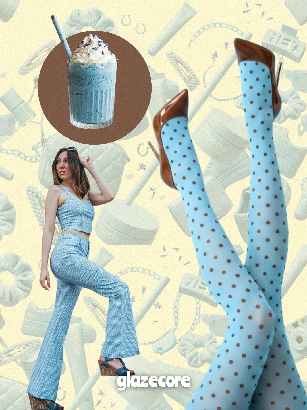
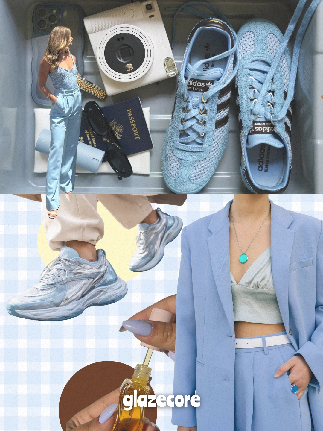
How It’s Actually Showing Up
This isn’t just runway theory. It’s already in rotation.
- Baby blue knits styled with deep chocolate brown
- Icy blue sneakers cutting through neutral outfits
- Polka dots and stripes mix cool blue with warmer tones
- Glossy accessories that feel almost liquid
The brown pairing is key. It grounds the coolness, makes it wearable, and gives it depth.
Without it, blue risks feeling too sterile. With it, it becomes rich, intentional, and expensive.
And then there’s the pattern play.
Polka dots are back, but sharper. Stripes are cleaner, less nautical, more graphic.
Everything feels slightly more designed, less romantic.
Butter Yellow Isn’t Done (And That’s Important)
Don’t get it twisted. Butter yellow didn’t disappear. It evolved.
Now it’s mixing with cool blue in ways that feel fresh instead of nostalgic. Soft meets sharp. Warm meets cold. Sweet meets controlled.
You’ll see it in sneakers first. Then in sets. Then, in those “effortless” outfits that are actually very calculated.
This contrast is where things get interesting.
Because fashion right now isn’t about picking one mood, it’s about tension.
And Then There’s Mint…
Quietly creeping in. A little greener. A little fresher. Less obvious than blue, but living in the same universe.
If cool blue is the main character, mint might be the underrated side plot that ends up stealing attention later in the year.
Watch it closely.
So… What’s the Final Blue?
Here’s the truth no one wants to admit this early: We don’t know yet.
Is it going to stay icy and digital?
Will it soften into something more wearable?
Will it lean toward aquatic, metallic, or pastel again?
That’s the game now. Trends don’t arrive fully formed anymore. They evolve in public. But one thing is clear.
Cool blue isn’t just a color. It’s a shift in mood. Less softness. More precision. Less nostalgia. More now.
And if you’re paying attention, you’re already wearing it.


