
From Cool Blue to Persimmon: Meet the 2026 Pinterest Palette™
Color is officially done playing it safe. Pinterest just unveiled its 2026 Pinterest Palette™, and the message is loud, emotional, and unmistakably confident. Pulled from what millions of users are searching, saving, and obsessing over, this five-color lineup captures a cultural craving for optimism, drama, and feeling something again.
After years of neutrals dominating fashion, beauty, and interiors, this palette marks a clear vibe shift. People want color with purpose. Shades that ground them, energize them, and visually express how they want to show up in a chaotic world. Pinterest Palette™ 2026 answers that call with hues that feel expressive, wearable, and culturally tuned in.
The Five Pinterest Palette 2026 Colors Defining the Year Ahead
Pinterest describes these as full-volume colors, and they deliver. Each hue carries a distinct emotional identity, designed to spark creativity across fashion, beauty, home, and digital aesthetics:
- Cool Blue
Frosted, focused, and effortlessly modern. This icy blue brings calm clarity with a sharp, editorial edge that feels clean and intentional. - Jade
Earthy yet elevated. Sitting between mint and moss, Jade blends serenity with sophistication and feels instantly luxe. - Plum Noir
Dark, decadent, and dramatic. A rich mix of deep purple, burgundy, and velvety brown made for confident, cinematic moments. - Wasabi
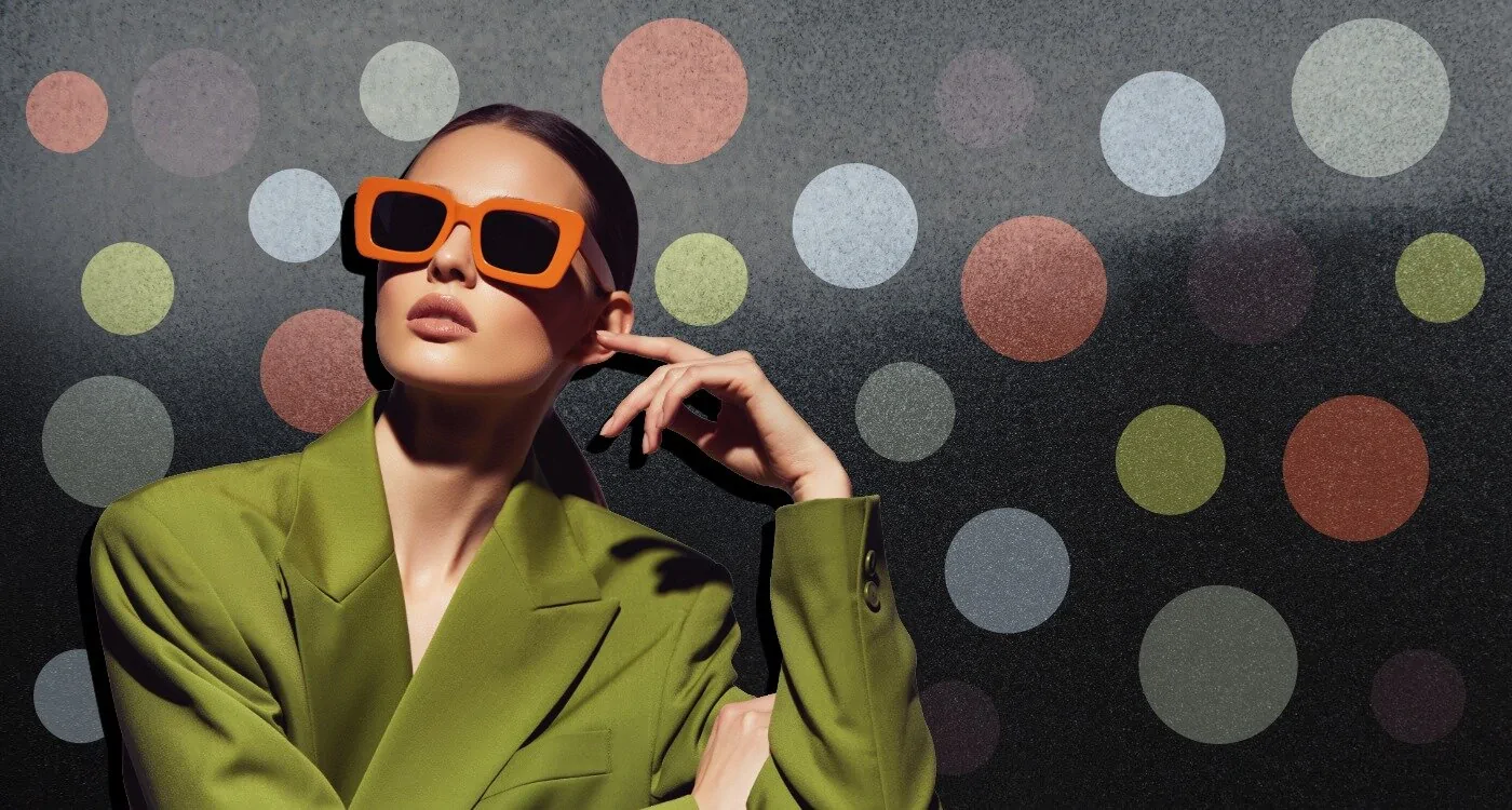
Electric and untamed. This high-voltage chartreuse injects fearless energy into everything from makeup looks to moodboards. - Persimmon
Warm, juicy, and joyful. A radiant red-orange that delivers instant optimism and unapologetic feel-good heat.
Together, these shades create dynamic sub-palettes that amplify their impact. Cool Blue paired with Wasabi brings chilled chaos energy, while Persimmon and Plum Noir blend warmth with mystery for a rich, fashion-forward contrast.
Why the Pinterest Palette 2026 Matters for Fashion and Culture
Pinterest Palette™ is built on data, not guesswork. The platform analyzes billions of searches and saves across its global user base, using proprietary visual search technology and expert curation to identify colors gaining real momentum. The result is a forecast rooted in how people are already building aesthetic worlds online.
As Pinterest’s VP of Global Creative Xanthe Wells notes, people are ready to move beyond quiet and neutral. The 2026 palette invites experimentation, emotional expression, and a more playful relationship with color. It reflects a collective desire to be seen, to feel good, and to design lives that look as vibrant as they feel.
The Bottom Line
With the 2026 Pinterest Palette™, color steps beyond decoration and becomes a way to shape mood and emotion. These hues are bold, intentional, and deeply tied to how people want to feel and be seen in the year ahead. Scroll through the Pinterest moodboard below, and you’ll see it instantly: this is the official end of playing it safe, and the start of a color era that feels iconic, expressive, and unapologetically alive.


