
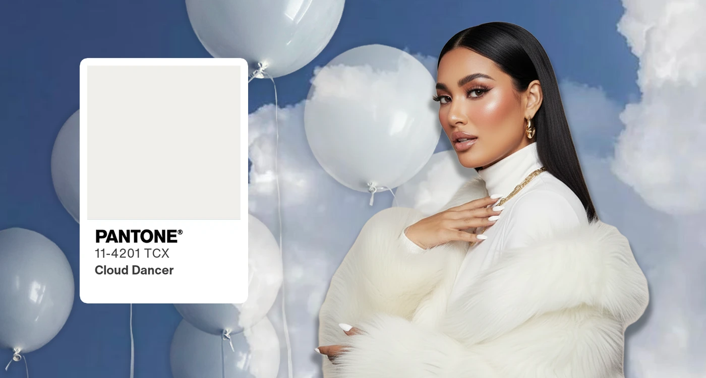
Every year, Pantone announces a shade, and like clockwork, the internet reacts. Think pieces. Moodboards. Brand rollouts. Jokes. Predictions. Obsessions.
We never choose the color.
It chooses us.
But beneath the hype, something quieter happens.
A collective recognition.
Because the Color of the Year isn’t really about design.
It’s about how we feel, together.
A Color as a Collective Mood
Pantone doesn’t just name a color.
It names a moment.
The shade always arrives carrying the emotional residue of the year we’ve lived through, the chaos, the hope, the exhaustion, the softness we’re craving more of. It becomes a visual shorthand for where we are mentally, culturally, spiritually.
That’s why it works.
Not because it’s trendy, but because it’s accurate.
A color becomes a mirror.
And suddenly, we’re all looking into it at the same time.
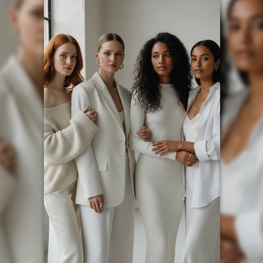
Why We All Project Ourselves Onto It
Ask ten people what the Color of the Year means, and you’ll get ten different answers.
Comfort. Renewal. Escape. Power. Calm. Optimism.
That’s the magic.
Pantone gives us a base note, and we finish the sentence ourselves. Fashion turns it into silhouettes. Beauty turns it into mood. Interiors turn it into atmosphere. People turn it into identity.
The color becomes a blank emotional canvas.
A place where personal meaning meets shared language.
This is how community forms, not through sameness, but through resonance.
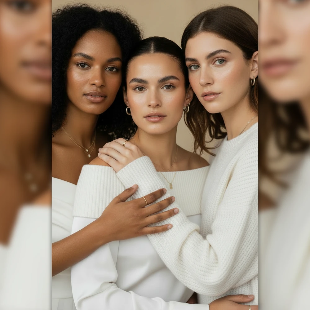
Softness as Strength
Lately, Pantone’s choices lean gentle. Airy. Emotional.
Not weak but intentional.
In a culture that rewards loudness and urgency, softness feels radical. Choosing a calm color in a loud world is a form of resistance. A reminder that slowing down, feeling deeply, and choosing tenderness is not falling behind, it’s moving forward differently.
The Color of the Year isn’t asking us to consume more.
It’s asking us to feel more.
Why We Keep Coming Back to It
Because once a year, we like being aligned.
One color. One moment. One shared emotional reference point.
It gives us permission to reset, visually and mentally.
And maybe that’s why it matters so much.
Not because it tells us what to wear or buy.
But because it reminds us that we’re not alone in how we’re feeling.
The GLAZECORE Takeaway
The Pantone Color of the Year isn’t a rule.
It’s an invitation.
To notice.
To reflect.
To choose beauty with intention.
One color.
A million interpretations.
And a quiet sense of togetherness woven through it all.
That’s not branding.
That’s culture.


